Mail That Makes You Feel Something (Yes, Even Paper Can Do That)
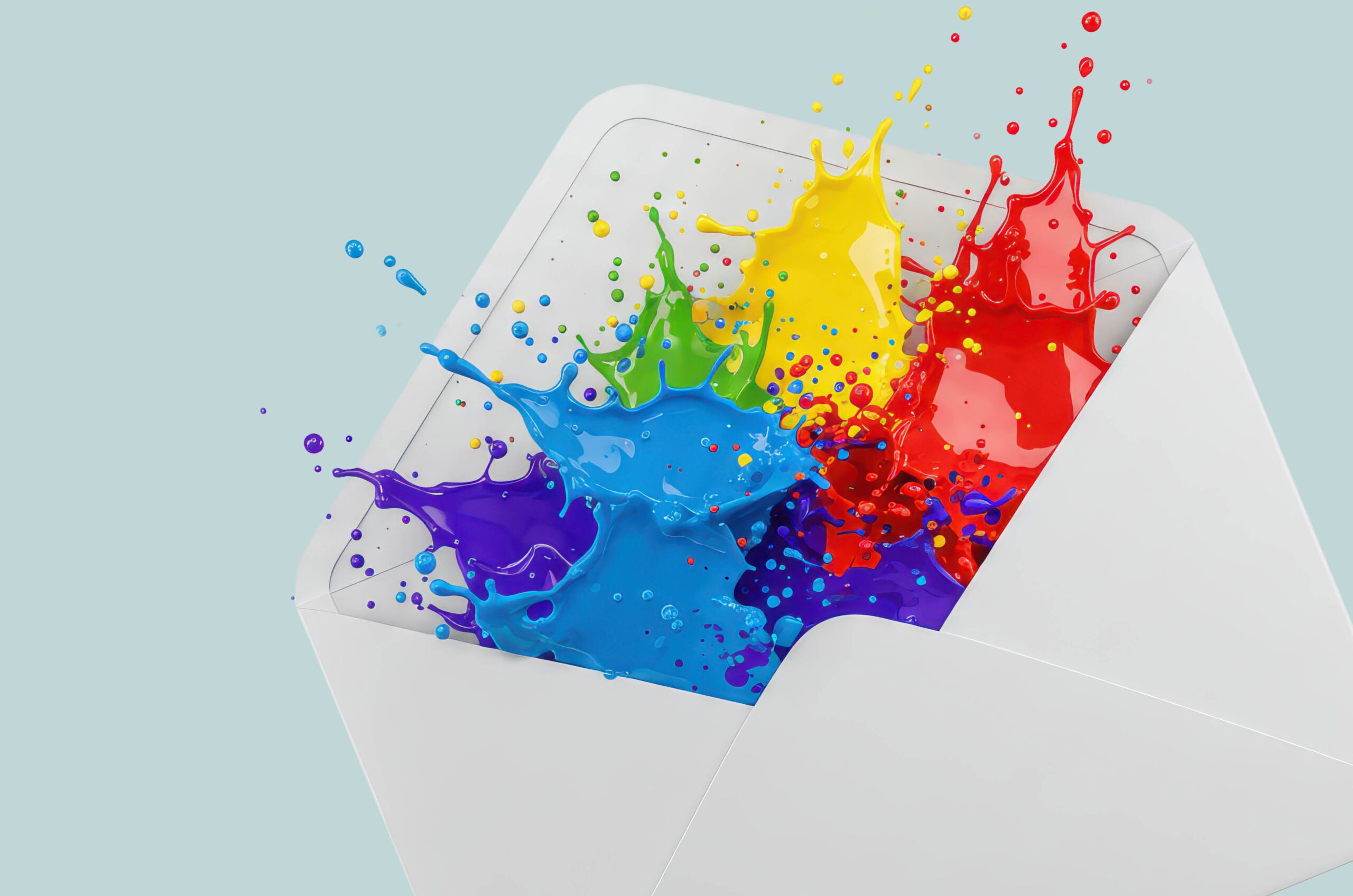
We’ve all held a piece of mail that stopped us for a second. Maybe it was the texture, maybe the design, maybe the story. You didn’t just read it — you felt it.
That’s not luck. That’s design with intent.
At Pixa Creative, we don’t just make things look nice — we make them mean something. Because let’s face it: donors don’t fall in love with good kerning. They fall in love with stories that feel alive.
1. Start with the Feeling, Not the Font
Before you pick Pantone colors or debate serif vs. sans, ask one question: What do you want them to feel?
Hopeful? Proud? Fierce? Inspired?
That emotion becomes your north star.
Design is emotional choreography — every photo, headline, and margin placement should nudge the donor toward that one powerful feeling.
Creative Truth: Pretty is polite. Powerful is persuasive. Choose powerful every time.
2. Layouts Are Like Music — Build the Rhythm
Design isn’t static — it’s movement. It should lead your reader’s eye the way a great song pulls you toward the chorus.
Big image. Short copy. White space. Bold statement. Repeat the rhythm.
When the layout flows, the message sings. And yes, we test our designs at arm’s length. If it doesn’t read like a story from three feet away, it’s not ready for prime time.
3. Texture Speaks Louder Than Taglines
Digital is jealous of print because print can be felt. Paper texture is brand voice you can touch.
Matte whispers trust. Gloss shouts energy. Uncoated stock feels human. Embossing says “we care about details.”
Pixa Direct confession: We could talk paper weights the way sommeliers talk wine notes. (“Ooh, a 120-pound Cougar Opaque with a hint of soft-touch finish? Exquisite.”)
Because if your mission is human, your materials should be too.
4. Invite the Donor Into the Scene
Don’t make your donors spectators — cast them in the story.
Try a fold-out map that shows where their dollars go. Add a peel-and-reveal note that says, ‘You made this happen.’ Slip in a QR code to a quick thank-you video.
When people interact, they invest. That’s the magic of mail that talks back.
5. Marry Art and Analytics (They Actually Like Each Other)
We’ve got news: data and design aren’t enemies — they’re that power couple that finishes each other’s sentences.
Your data tells us what works. Your design tells donors why it works.
So when Pixa Direct personalizes content and Pixa Creative designs it, you get campaigns that look custom because they are. Insight meets instinct. Barcode meets heartstring.
6. The ROI of Goosebumps
You can’t measure emotion — but you can measure what emotion does.
When people feel something, they act. They give. They stay.
That’s why great design isn’t decoration; it’s retention strategy.
Track your open rates, response rates, and repeat donations — then trace them back to creative that made donors care. You’ll see it plain as day: emotion equals engagement.
Here’s the Bottom Line
Mail that moves people doesn’t come from templates. It comes from teams that care — about story, texture, timing, and truth.
At Pixa Creative, we design with feeling. At Pixa Direct, we bring that feeling to life with ink, data, and precision.
Because when your mail moves people, your mission moves forward.
Ready to make something unforgettable?
Let’s start with your next piece.